The Disneyland Park Guide Map: A Roadmap Through History
The official Disneyland Park guide map is more than just a navigational tool; it is a continuously evolving piece of Disney artistry, merchandising, and historical record, given freely to every guest upon entry.
I. Core Characteristics (Consistent Elements)
Despite decades of change, the maps maintain several key structural features:
- Format: Traditionally, a single, large sheet of glossy paper folded into a compact, pocket-friendly brochure (often an accordion or gatefold style).
- The Park Map: The core feature is a highly stylized, illustrated aerial map of the park’s layout. It is not strictly to scale, as Imagineers prioritize visual appeal and clear representation of key features (like Sleeping Beauty Castle and the mountains).
- Essential Information: The maps always include a key/legend for identifying services (restrooms, First Aid, ATMs), a listing of attractions by land, and a dedicated panel for guest policies and important notices.
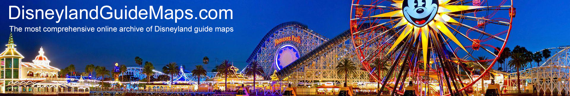
- Cover Art: The outside panel (the “cover”) always features high-quality, seasonal, or promotional art designed to draw attention to a major new ride, anniversary, or special event running during the map’s circulation period.
- Complementary Piece: The map has historically been printed alongside a separate, smaller Times Guide (or integrated into one panel), providing show schedules and character meet-and-greet times.
II. Evolution of Style (1955 – Present)
The visual style of the Disneyland guide map has gone through several distinct eras, reflecting changes in graphic design, park ownership, and technology:
Era and Key Features of the Map
1955 – 1965
The gate maps were often simple, quad-fold brochures. Established the iconic isometric aerial perspective that is still used today.
1965 – 1980s (Graphic Clarity)
Maps became cleaner, often using a less ornate, more functional graphic style. Land borders were clear, and colors were distinctly applied. Information started to become denser. Emphasis shifted slightly from “art piece” to “functional guide,” often featuring a simpler, less cluttered feel.
1990s – 2000s (Thematic Detail)
The map art returns to a highly detailed, charmingly illustrated style. Park updates become frequent, reflected in the map changes (e.g., the introduction of Critter Country, Fantasmic!, and later, Star Wars: Galaxy’s Edge). The map officially incorporates the presence of the second park, Disney California Adventure, though maps for each park remain separate.
2010s – Present (Digital Integration).
The physical map remains vital but works in tandem with the Disneyland Mobile App. Designs are colorful and dynamic. The cover art is crucial for marketing seasonal events like Halloween Time and Holidays at the resort. Content is streamlined, sometimes directing guests to the mobile app for the most up-to-date show times, accessibility, and dining details.
III. The Map as a Historical Record
For collectors and historians, the guide maps are invaluable because they provide an accurate, dated snapshot of the park at a specific time:
- Attraction Tracking: They document the opening and closing of every ride and show.
- Theming & Expansion: They visually record major physical changes, such as the full transformation of the area around the former Carousel of Progress, the expansion of Fantasyland, and the addition of entire new lands.
- Corporate Sponsorship: They are a record of park sponsors (e.g., Kodak, Bank of America, Sunkist), whose logos and sponsored attractions appear on the map’s panels.
The Disneyland guide map, therefore, functions as both a cherished free souvenir and a detailed, primary source document of the resort’s living history.